Padma Binani Foundation, the cultural and social wing of Braj Binani Group approached Muse for Creative Development & Branding of their annual event, Vatysalya Awards. The brief consisted of developing concept theme, event branding, creative event merchandising, collaterals, invitations and giveways for Vatsalya Awards which gives awards and acknowledges regional language writers of children literature.
Muse Approach:
Muse is always excited to work for projects with social and cultural relevance. The Padma Binani Foundation strives to create a widespread awareness of our rich cultural heritage and endeavors to bring Indian cultural heritage closer to the younger minds.
After one to one interaction sessions with the team members and advisory board of the Foundation and having researched their past work, Muse suggested to develop a concept that will give a comprehensive view of the Foundation’s mission and activities. The Padma Binani Foundation has established three bodies - Vatsalya, Akshar and Suranjali to achieve its objectives to make notable contributions in the fields of education, literature, the fine arts and music. Muse suggested that branding exclusively only one of the three wings of foundation, in this case Vatsalya will not be able to create the desired brand identity of the same. The three bodies though catering to different elements of the society and culture (literature and music) share a common core essence, which is the vision of the Foundation. Hence, Muse proposed to develop an exclusive painting which will not only encompasses all the aspects of the Foundation but will give a unique identity to each of the Foundation’s bodies. The painting will visually journey through the core values and goals of the Foundation. The proposal was welcomed by the Foundation with hope and excitement.
Decoding the Elements of the Painting
The concept of developing a Painting for The Padma Binani Foundation was envisioned and executed by Manoj Maurya, Director, Muse Advertising. Says Manoj, “It was a challenging task for me as it is difficult to segregate a part from the whole, without disintegrating the whole. It is just like human beings and the universe; though identifiable as separate persons, we are fully connected parts of the larger physical world."
In order for me to create a piece of art, I need to be completely convinced with the ideologies and the values. I started thoroughly researching the goals of each of the bodies of the Foundation. The first arm- Vatsalya has projects that are child-centric and are envisioned as conduits to knowledge for young and impressionable minds. On personal front, I been working towards propagation of importance of knowledge and the same has been one of the core defining values of my being. For me knowledge is the light, (Tamso ma Jyotirgamaya). The potential of this light to create positive impressions is very high when the mind is young and raw. Hence, I have used the raw earthen effect with footprints which gradually turn into light with a small twig. Any seed to reap requires fertile soil, water and light. In case of young minds, they require love, knowledge and encouragement which Vatsalya provides.
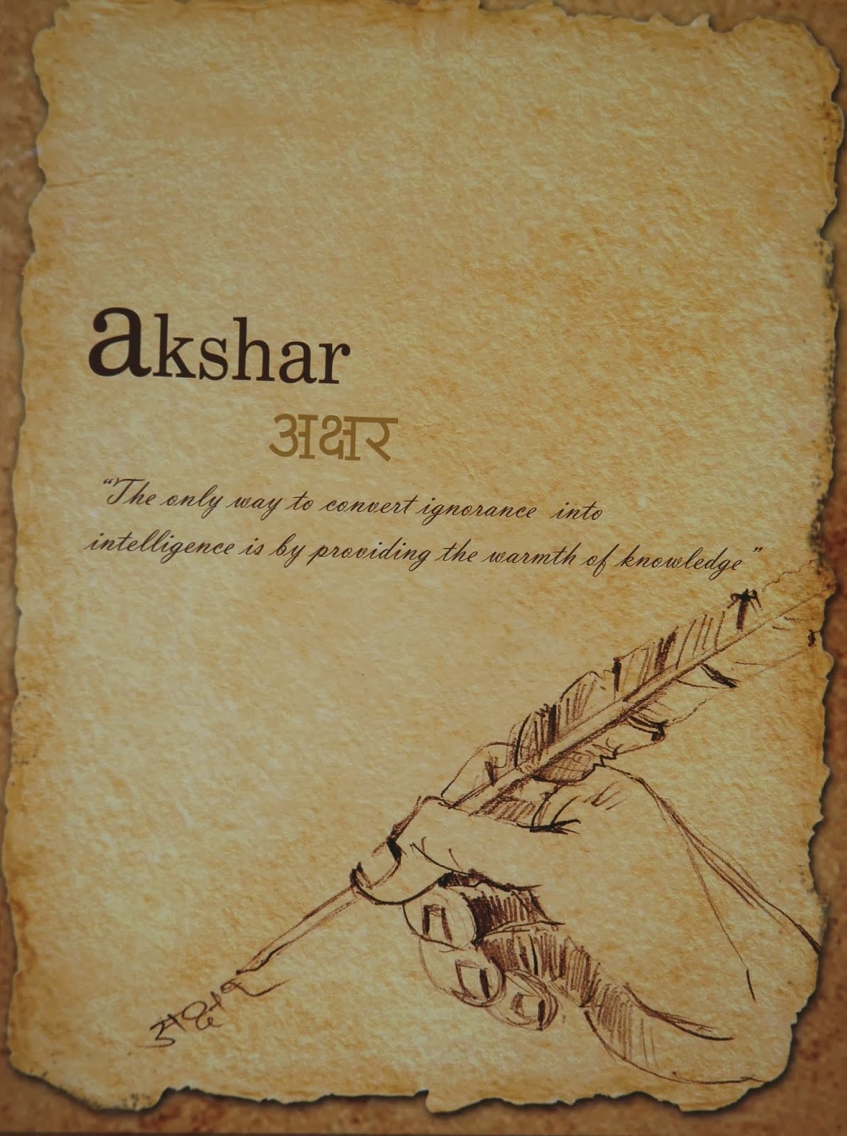
As another part of the whole, Akshar as the publishing arm of the Padma Binani Foundation continues to enrich the future of children with Indian literature in all the major languages of India. Well equipped with the knowledge, the twig develops into beautiful well spread branches.
Since Suranjali, the musical wing of the Padma Binani Foundation was conceived by Smt. Padma Binani, in fond remembrance of late Shri G.D. Binani, I was driven to use reds for this section. It not only represents fondness but music as way to enlighten soul finds perfect resonance with this color scheme. By this time, the branches have well grown into a wonderful tree which is capable of giving love and warmth to the society.”
The painting summarizes the goals of the Foundation and visually depicts the positive outcome that the Foundation is headed towards.
Adaptations of the painting:
1. Brochure
The Foundation could easily assimilate itself with the painting and decided to adopt the painting as its Brand Identity. The Foundation was given the rights for adaptations into print and electronic media. Muse Advertising designed a 24 pages brochure for the event. The brochure talks about the Foundation and Vatsalya Awards. The scope of work for the brochure consisted of concept, design, content writing and illustrations.
Muse suggested development of an illustration and copy for each for the three bodies- Vatsalya, Akshar and Suranjali in order to instantly communicate their objectives directly to the masses.
2. Invitation Cards
The invitation was as Indian and exotic as
the event and its target audience consisted of political class, community
leaders, literary stalwarts and dignitaries. The Invitation was given the shape
of a flower whose each petal carries an important announcement of the event. Along
with the Invitation Card, we designed a personalized letter from Shri. Padma
Binani inviting the guests to be a part of the event.
3. Event Backdrops
The Vatsalya Award
2008 was given to the eminent Marathi writer Prof. Shri. Anant Bhave at a
glittering function organized at Taj President, Mumbai. The function was
presided over by Shri Ashok Chavan, the Chief Minister of Maharashtra and other
eminent guests were Shri. Dilip Walse Patil and Shri. Nana Chudasama. At this
event a music album for children titled ‘Nanhi Kiran’ and a book ‘Bharat
Darshan’ were released in the scope of Suranjali and Akshar respectively.
4. Event Give Aways for
the Dignitaries
The Give Aways in the
form of the music album titled ‘Nanhi Kiran’, the book ‘Bharat Darshan’, event
brochure and other event merchandising were presented to the guests in the form
of an exclusive customized box made for the event.
5.Website & Social
Media
The official website
of the Foundation and its social media perfectly synched with the Foundation’s
branding.


